Creative Charting in FileMaker

When you think of charts in FileMaker, you’re probably thinking of plain, simple charts. Charts can be manipulated to make an assortment of things. Here are a few examples.
Combination Charts
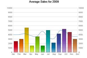
You can display a hybrid of two charts by superimposing them and making the topmost chart transparent and matching the scales. One thing to keep in mind is that the built-in tooltips will not work for the bottommost chart since the top one is covering it.
(superimposed charts)

Changing View
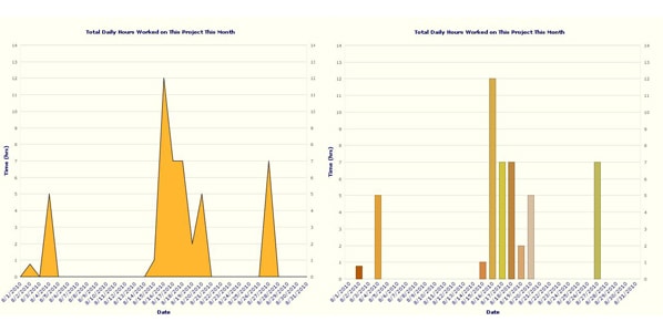
You can use a tab panel to place different charts representing the same data on each tab. Then write a script that toggles between the tabs when you click on the chart. This will let you display the same data in different views. Sometimes a pie chart may be the desired view, but if there are too many slices, the labels get overlapped. Having a bar chart available when clicking the chart will reveal the information you were looking for.
(simulating before and after clicking the chart)

Timeline
Although much more complex, it is possible to make a timeline with a bar chart. This involves much more complex scripting and the use of a dummy table. One record is created for each day within the date range. In the dummy table, there is a calculated field showing the milestones with the date on the appropriate day. The calculated field is the one used for the X axis.

 Gauges
A very slim bar chart and a few strategically placed objects can be used to mimic a thermometer. This one is used as a percentage gauge, but could as easily display dollar amounts for a fundraising activity for example. You could hide the numbers on one side by simply covering it up with an object matching the background colour, but in this case, having the numbers on both, the right and left side, furthers the illusion that it is a thermometer with *F and *C.
These examples are only scratching the surface when it comes to what you can do with charts in FileMaker. Let your imagination run wild and see what you can come up with!


Comments